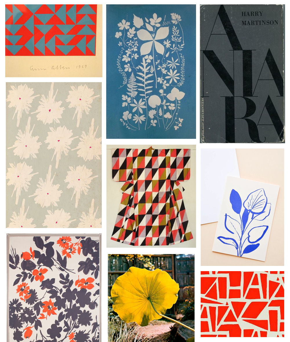
Thoughts on COLOR
“We need a new rainbow.” —William Justema (The Pleasures of Pattern, page 151)
Color combinations are the driving force of my pattern art. I love discovering surprising and unusual color combinations, because they capture my attention and can convey a specific mood or feeling.
I will share a couple of other artists’ methods for creating color palettes as well as my own process.
William Justema: Color Swatches
In The Pleasures of Pattern, William Justema presents an exercise for creating new color combinations. He empties a bag of hundreds of swatches of colors on a table, and has his students pick two colors that they can’t imagine ever going well together. They then challenge another student to find an additional color or two that, in combination with the original two colors, makes a satisfying color palette.
He writes, “it will soon be grasped that neutrals are seldom a solution, and that recourse to adjacent (or analogous) colors leads straight to banality.” I like this intuitive way of creating color combinations, by looking at colors together and deciding whether they work together or not.
I picked an ash green and blue as my starting pair of colors, and then I tried a handful of combinations to try to make a pleasing palette.

I like the three palettes in the image above. In the first two palettes, the additional colors create a classic but interesting palette, because the colors are a bit different than traditional primary colors. In the rightmost palette, I added a snippet of a painted paper that I think complements the pair nicely because the teal brightens up the palette and the pink paper looks nice with the blue.
This next set of palettes all seem a bit dull to me, because none of the additional colors brighten up the palette:

The next set of palettes all remind me of something. In the first palette, adding purple makes me think of a swimsuit print. In the middle, adding bright yellow makes me think of a preschool color palette. In the third palette, adding golden yellow reminds me of a fall color palette. I prefer to use color palettes that appear new to me instead of ones that remind me of something else already.

Melissa Thorne: Found Colors
Melissa Thorne describes another way of creating color combinations her talk at RMCAD (https://livestream.com/RMCAD/melissathorne). She describes her method of creating “found color” palettes by matching colors she sees in her environment, such as matching the colors of leaves from a certain place or matching the colors on a graffitied wall.

In the photo above, I show my color palette from matching colors to the peony flower. This was an interesting exercise for me because it made me pay close attention to matching the exact colors I saw in the petals. It helped me make more subtle color adjustments than I usually do when mixing colors. The petals are actually much more yellow than I thought at first glance. I enjoyed the challenge of capturing the color of the petals in a shadow (the second paint chip in the photo).
My Methods: Pinterest

One way I have learned what color combinations I really like is by creating a color board on Pinterest. When I look back at images with colors that I like, I can start to see patterns in what color combinations draw my attention.
I am drawn to bright red orange, a variety of blues, and occasionally bright yellow. I think that I like the classic feeling of the primary colors, but also that they are kind of playful, especially when they are a little different than the traditional crayon red, blue, and yellow.
Understanding my color preferences helps me choose what color paper to start with and what colors I might want to add as I’m working on a pattern.
My Methods: One Color at a Time
I work on patterns one color at a time. I start with the color of the paper, then add a design in a second color. In the image below, I have started a pattern of light lilac flowers painted on tan paper. I have adapted William Justema’s method to help me figure out the next color I want to use in a pattern. I place a handful of paper swatches on my pattern to see which additional colors work best.

In this example I really like the light peach circle in the 4th row! This color brightens up the palette but also blends in nicely. I repeat this process with each new layer of color.
If I’m adding colors with paint, I will “test” a small dot of a paint color in the corner of my paper so I can get a sense of whether it is the right color or if I need to adjust it a tiny bit. In the top right corner below I tried out a few different blues before painting the stripes.

Conclusion
Each artist probably has their own method of developing color palettes. Please share in a comment if you have your own method or know of other interesting methods!